Here’s a couple of 2019 magazine covers and feature article layouts. Even dry subject matter can be beautiful and reader-friendly.


Here’s a couple of 2019 magazine covers and feature article layouts. Even dry subject matter can be beautiful and reader-friendly.
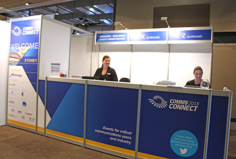
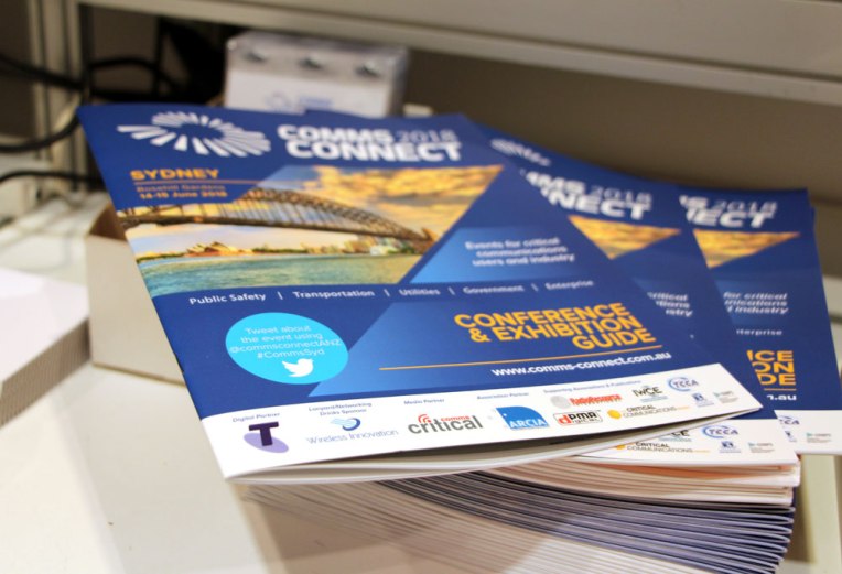
Comms Connect Sydney needed strongly branded exhibition signage as well as the conference and exhibition guide.
Large format posters combined beautifully into one large design. The 210x268mm guide featured the daily program, and showcased both speakers and exhibitors.
Everyone was thrilled with the professional end result.
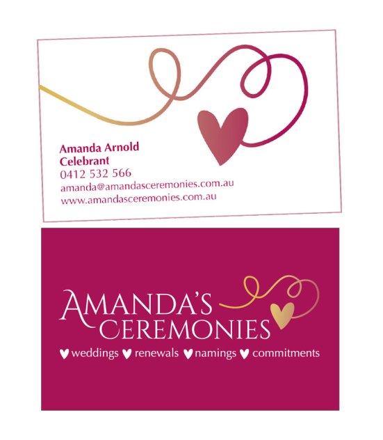
Brief: A no-fuss, beautiful logo for a marriage celebrant.
Solution: Classic serif fonts, with a touch of whimsy and a beautiful shade of not-quite-red, not-quite-pink, not-quite-wine that can be used throughout all of Amanda’s branding. We printed the card on 350gsm artboard with a matt laminate finish that gives a sense of quality whilst being completely economical.
Good luck with your business Mandy!
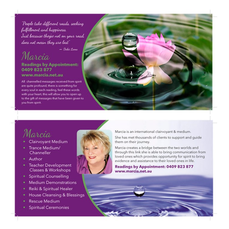
Brief: Marcia is a renowned psychic who wanted some promotional items that fitted with her New Age profession.
Design solution: For branding colours, we started with client’s choice of purple and contrasted it with green to bring in an earthy, fresh angle and keep it more modern than a lot of New Age design. Clear sans serif type was contrasted with a casual script. The droplet imagery was also selected by the client who felt a strong connection to these images.
We started with a business card and flyer and have since also produced bookmarks and worksheets.
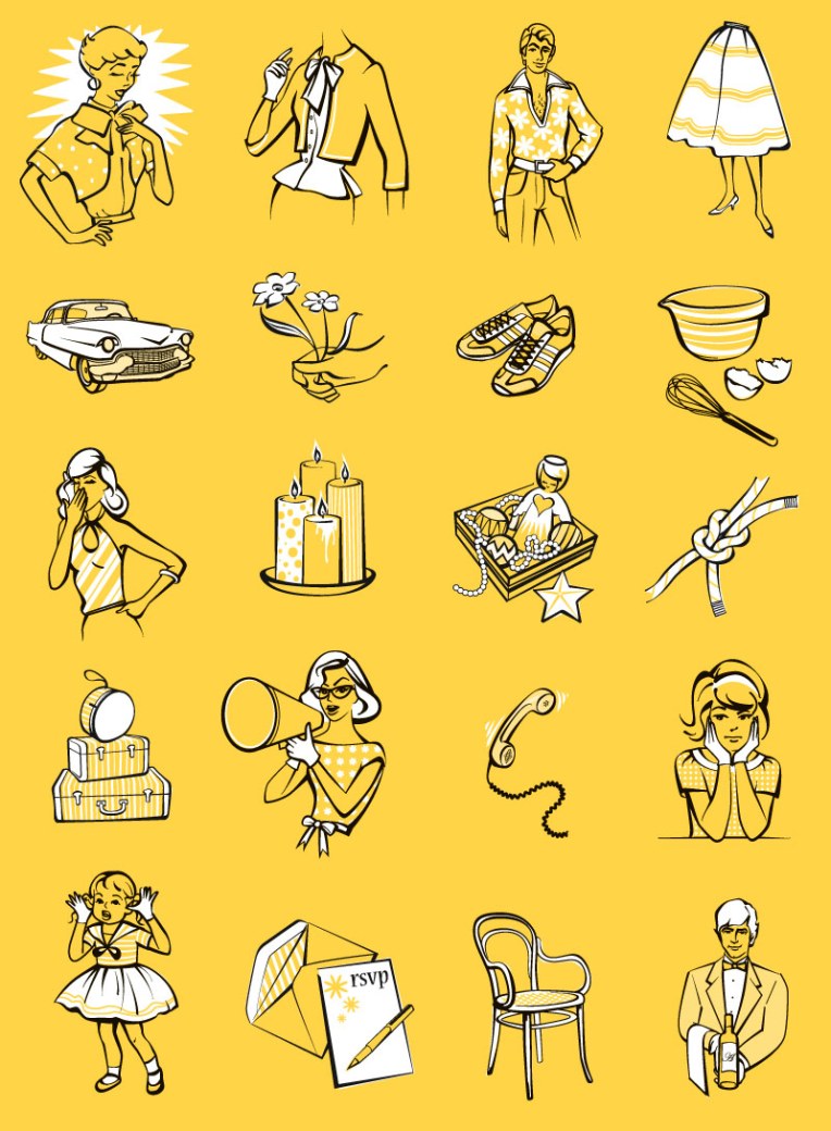
For a couple of years I supplied weekly illustrations for a column in Sunday Life! Magazine (it’s the Sun-Herald’s glossy insert). They were retro based, reminiscent of old sewing pattern illustrations and utilised just yellow, black and a bit of pattern.
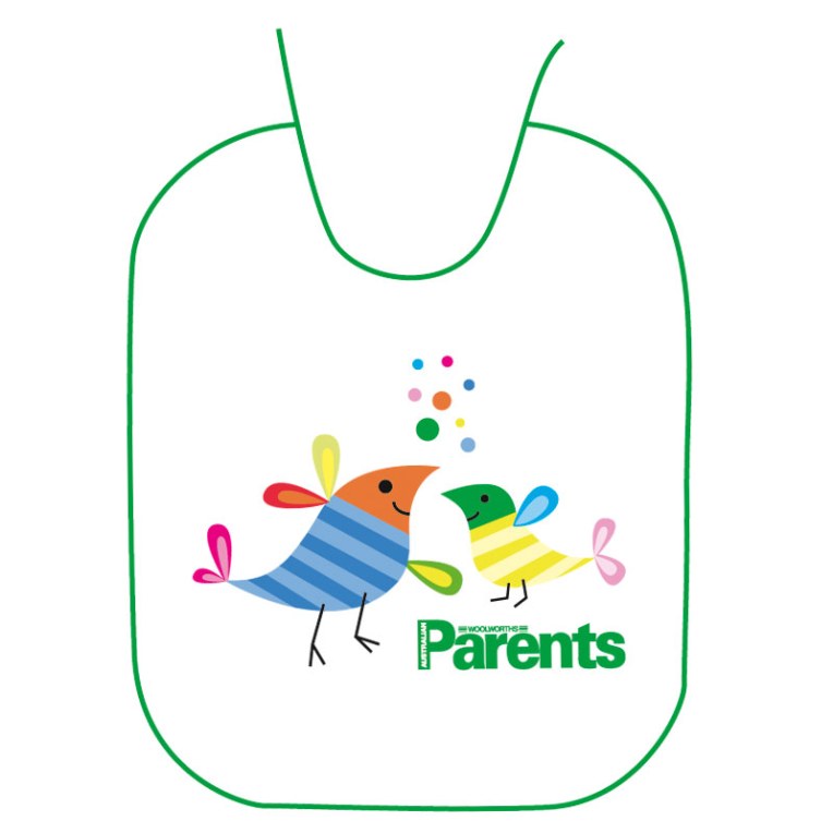
This little cutie is a bib, designed as a gift-with-purchase item for the now defunct Parents Magazine. The illustration needed to be fun, friendly and gender-neutral. We opted for a slightly retro, bird motif.
Brief: This new company needed a professional and affordable website to help them launch.
Design solution: Sticking to a clean grid, stock photography was chosen that conveyed the range of sectors that this lift engineering company was able to service. The design was left with room to grow along with the business as it expands.


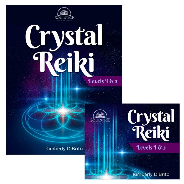
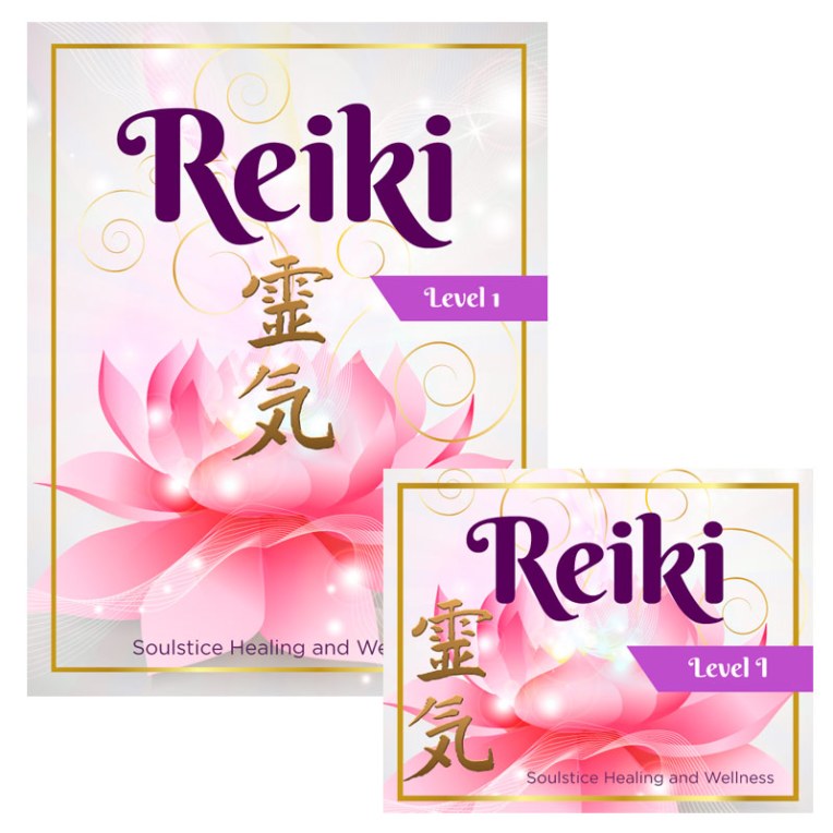
Brief: This client works in the New Age space, running courses for practitioners of reiki. She contacted me needing cohesive and professional looking covers for her training materials which included both books and CDs.
Design solution: To differentiate the two course streams, we opted for a light and dark theme, with the same font used to tie them both to the client’s brand. I supplied print PDF and web-optimised versions to suit various outputs.
This editorial illustration was completed for Reader’s Digest Magazine in 2002.